Have you ever thought you would like to bring a bold paint colour to your kitchen space and are unsure where to start?
How often do we go with a white kitchen space?
Have you ever thought you would like to bring a bold paint colour to your kitchen space and are unsure where to start?
How often do we go with a white kitchen space?
Let me inspire you with five bold kitchen paint colours and colour suggestions to get you started.
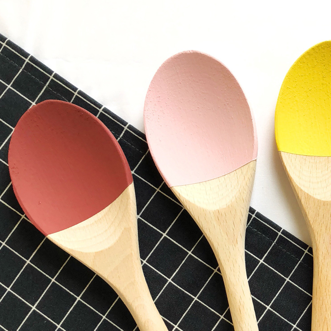
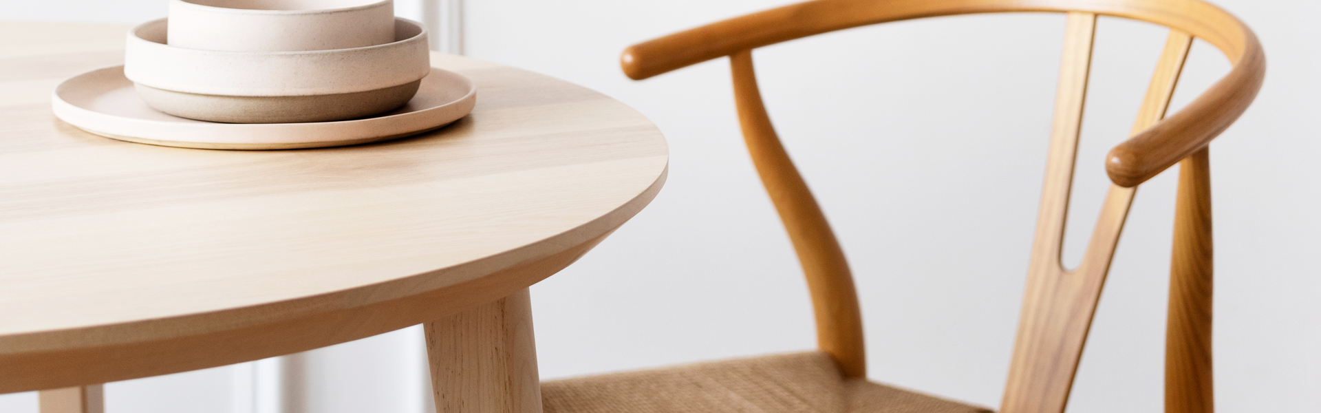
This is such a beautiful burgundy colour with an amazing name ‘Eating Room Red‘. Plus in terms of colour psychology, the colour red can often make you feel hungry and is sometimes suggested for dining spaces. This shade would look perfect for kitchen units and I would pair this with white walls and perhaps a soft maple worktop. Keeping the supporting colours soft lets the burgundy colour become the star of the room. Farrow & Ball also suggest other colours to pair this with too.
Pink is not usually a colour seen in kitchen spaces and why not? This shade is a lot lighter than you see on the Farrow & Ball website and another brilliant name ‘Nancy’s Blushes‘. Give this a glamorous look with the pink used on the kitchen walls. Perhaps pair this with a marble worktop, white units and copper accents.
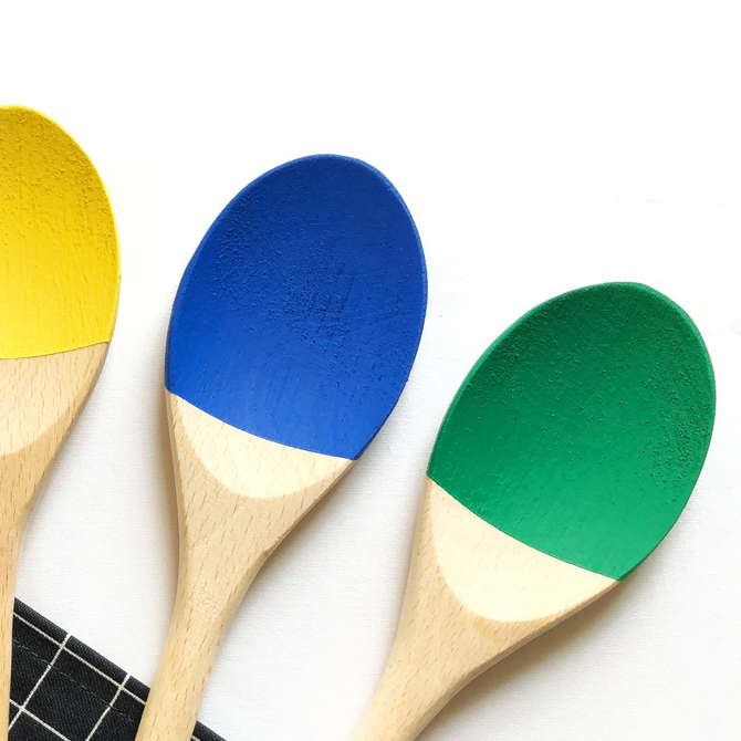
Don’t you love painting colours that remind you of a place and time? This bright yellow ‘Circle Line‘ by Myland would make me smile every morning when I popped into the kitchen. If you have a light room, you can use black to pair with the yellow and vice-versa, use white to pair with the yellow in darker spaces. Either way, it will make you smile. To keep it soft, I would use an ash worktop.
This is such a vibrant blue colour by Valspar – ‘Indigo Flame‘, I couldn’t stop smiling when I tested the colour. This has to be used on kitchen units with walnut worktops and would look very striking whilst still being elegant. To warm it up, I would use gold accent accessories and to keep it cool, use silver accent accessories.
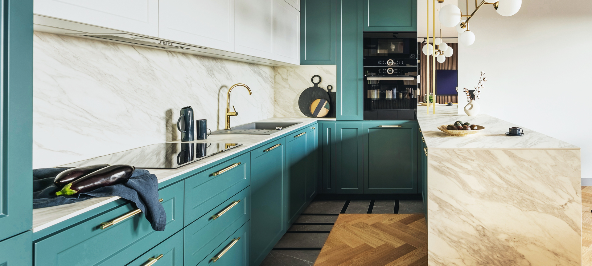
In the last couple of years, we’ve seen more and more green kitchens especially more on the side of dark green ones. ‘Lonesome Vale‘ colour by Valspar, hits you in the face with its gorgeousness, I would paint this colour in a kitchen in a minute. If you have a light room then pair this with dark wood and white walls with gold accents. Even use green on the walls too and if you’re not feeling brave go halfway up the wall.
If you need help choosing a bold colour for your kitchen then get in touch.
10 expert tips to elevate your space and create a flat that feels beautifully designed.